We were all sorts of giddy with excitement when PRIMIS got in touch with us to see if we could help them with a few enhancements to their internal Toolbox product; the back-office suite used by all PRIMIS members.
As the largest network in the UK of mortgage and insurance intermediaries we knew this was a project we could deliver SACKS of ideas and quickly got to work mocking up a revamped look and feel to their Toolbox product.
PRIMIS care deeply about their technology and invest in their own internal development team who are constantly rolling out ideas and features for their members but identified that they were lacking in experience making interfaces and systems look, well, spudtacular!
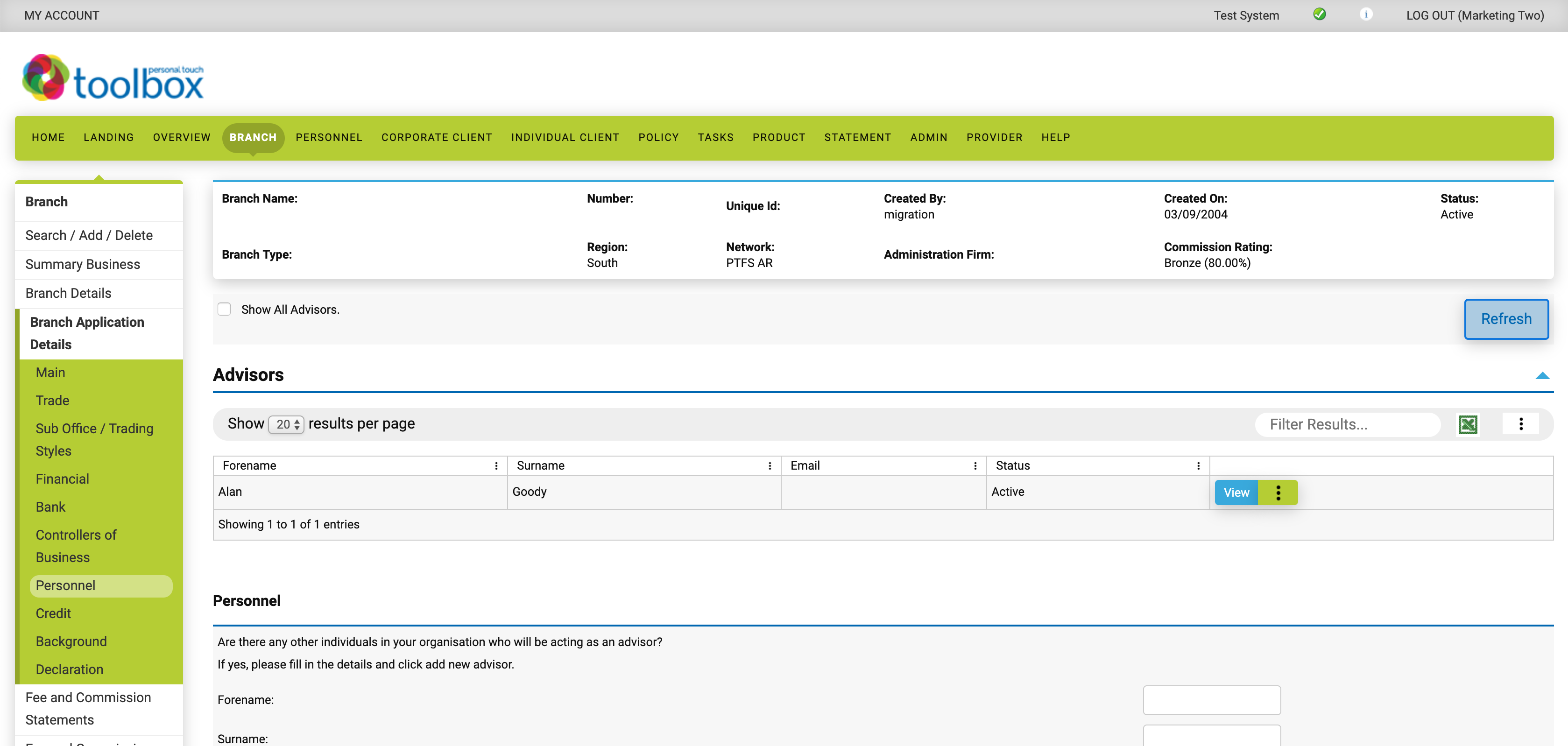
We identified a way that we could help refresh the look and feel of the Toolbox suite without needing access to the code and infrastructure. We worked closely with the team at PRIMIS to focus on the key parts used heavily by their clients and iterated over the designs quickly, whilst ensuring that it still worked for smaller viewports such as older monitors and systems.
Whilst we can't show you too much, we revamped their system with fresher colours (although those can be updated through their service too!) and a nice responsive layout, like below:

The most amazing part of this project was that we could achieve the reskin of the Toolbox service with minimal changes to the underlying code, meaning that the development team at PRIMIS could crack on with their day-to-day awesomeness whilst we blitzed through styling it up.
Once the revamp went live PRIMIS received incredible feedback from their members on the newer look and feel. We'll call that a success any day of the week! 👌

